Building a flawless website might be quite a challenging task if you aren’t particularly familiar with the industry. However, with the right guideline, you will be able to easily create a great legal website as long as you follow the latest standards.
One of the first rules when it comes to building a website of any kind is to stay up to that with the latest trends. Of course, legal websites are no exception.
Legal website users are familiar with a certain way these websites are supposed to look and you need to fulfill their expectations if you want to give them the best user experience. On the other hand, you also need to create a unique website that will stand out from the pack.
So how do you do that? Hopefully, this guideline will help you.
5 Golden Rules for Creating a good Legal Website
Rule 1: Clear Content Architecture
Legal websites are not exactly the best place for going overboard with creativity. Sure, adding some unique elements is good but not when it comes to organizing the content.
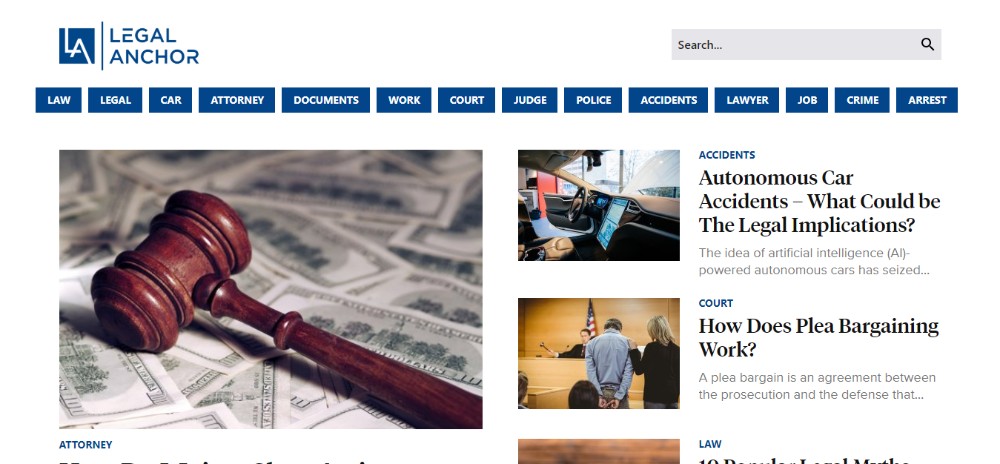
The problem with the legal websites is the fact that they are often very stuffy, especially legal information libraries and similar. In order to make it possible for the user to find exactly what they need, you have to organize the content within clearly labeled categories.
Also, keep in mind that the focus has to be on the content so don’t go overboard with any distracting elements. Always choose simplicity and stick to the minimalist design.
If you are looking for some good examples of a clear content architecture, check out Legal Anchor.
Rule 2: Incorporate Warm Colors in your Color Palette
In order to make legal websites seem more professional, the practice used to be to combine cold tones of grey, navy, and black.
However, now more than ever, people have found that incorporating one or more warm tones into the website design is not only more pleasant to the eye but it also makes your website recognizable.
Of course, that doesn’t mean going crazy with all different colors, but adding a spark of a “disruptive” color every now and then is a good thing.
Keglerbrown is a great example of using the yellow for that purpose. Look at this website and try to replace yellow with, for example, grey. Not so impressive, is it?
Rule 3: Use photos that tell a Story
One thing to always keep in mind is that people love to work with people. You want to establish the trust between the users and the team behind the website as soon as possible.
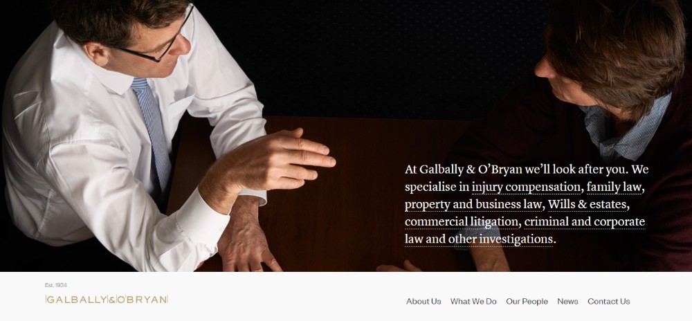
A great way to do that is by incorporating pictures of the legal team and the work behind the curtains. Not only do these photos tell a story but they also help show the humane side of your company.
Try not to use the fake stock-like photos if possible. Instead, put up the actual pictures of the hard-working members of the legal team as Lewisrice did.

Another good option is to use photos that capture the client meetings similar to this.
Rule 4: Add a Dynamic Factor to the Website
Making dynamic websites is one of the latest standards that will help you get the users’ attention from the moment they visit your homepage.
Add a presentation video filmed in the company’s HQ team or even a stock video with VO. Ideally, place the video on the homepage to ensure the users see it. Visit msk to get a better idea what it should look like.

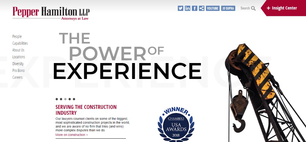
Another great option is using 3D animated elements, for example the logo, to make the page more memorable. Animated elements such as taglines and sliders are a good way of increasing the time the users spend on the page.
A good example of a dynamic website is Pepperlaw.
Rule 5: Use enough White Space
The corporate legal websites are usually packed with content which can easily make them overwhelming or confusing. You should take some of that pressure of the users by using enough white space, centering the content, and using lots of bullet points.
Stick to the minimalist design and keep the content well organized as Jennyodegard did.

However, the majority of legal websites has so much content to publish it is hard to incorporate a sufficient amount of white space. If you find yourself in a situation like that, make sure to maintain the organized look by using blocks and keeping the website simple, similar to this.
Conclusion
In order to create a beautiful and fully functional legal website, you need to be familiar with certain standards and rules that are to be followed.
If you are a creative type, the key is to dose your creativity correctly. Stick to the industry-related standards but allow yourself to add a touch of your own style into the mix to make the website stand out from the crowd.
As long as you don’t go overboard with drawing “outside the lines” and fulfill the basic users’ expectations, you should be ok. To ensure you are doing it right, stick to the above-mentioned 5 golden rules for creating a flawless legal website.




Leave a Reply